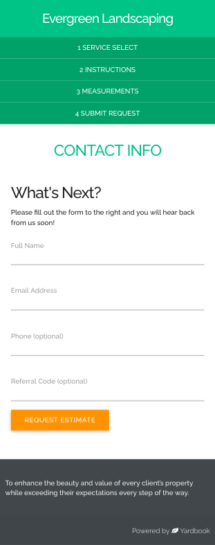
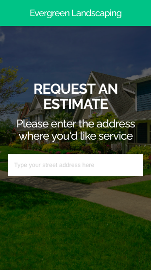
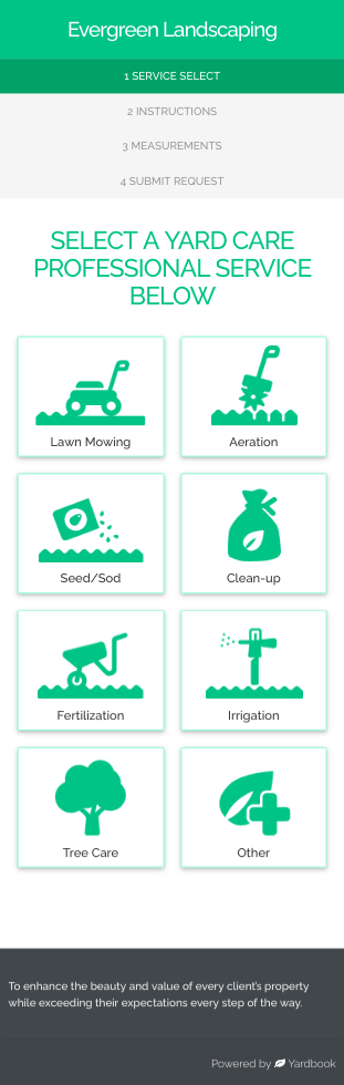
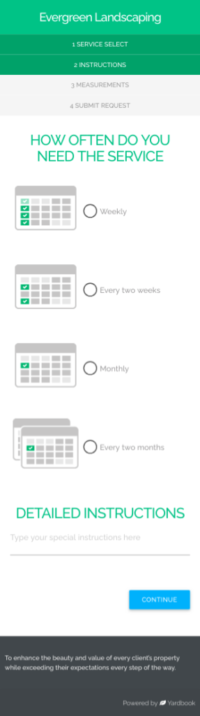
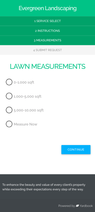
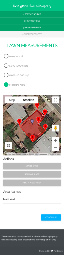
When a website is responsive, the layout and/or content responds or adapts based on the size of screen they are presented on. A responsive website automatically changes to fit the device you’re reading it on.
The Get Quote Page has been redesigned to be mobile-responsive. This will create a better experience for your customers/prospects when they order new services on their phones.
Responsive Design